Color psychology for interiors gives decorating a human starting point. It connects paint, textiles, and accents with emotional experience. A room can look beautiful but feel wrong. That usually happens when color ignores behavior. Some spaces need energy and movement. Others need quiet, focus, or softness. Color can support those needs when chosen thoughtfully. It can also guide how people gather and relax. A good palette feels personal, not random. That is where psychology becomes useful and practical.
Purpose gives color a stronger foundation. A reading corner needs a different palette than a playroom. A guest room should feel welcoming and restful. A creative studio may need brighter visual energy. A room mood planning tool helps match purpose with feeling. It also reduces second-guessing during selection. Color becomes less about trends. It becomes more about daily experience. The best room feels aligned with its use. That alignment makes design decisions easier.
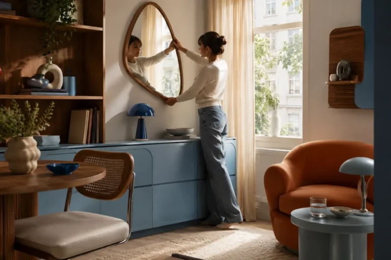
Warm colors often create closeness. Terracotta, ocher, blush, and caramel can feel inviting. They work well where people gather. Dining areas often benefit from that warmth. Living rooms can feel more social with earthy undertones. A warm color palette can also soften modern furniture. The key is balance. Too much intensity can feel heavy. Neutrals, woods, and soft lighting keep warmth comfortable. The room should feel welcoming, not visually loud.
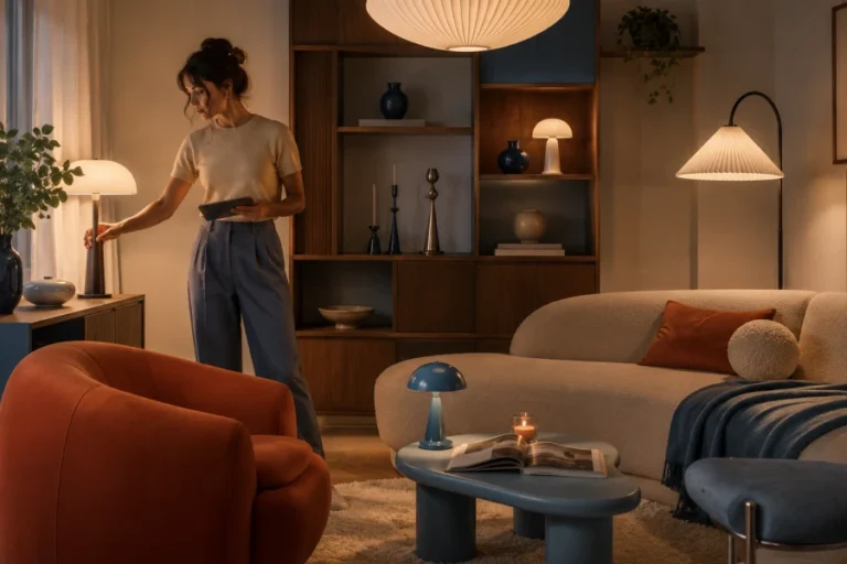
Cooler shades can support calm and clarity. Soft blues may feel airy and quiet. Muted greens can bring a natural mood indoors. Pale grays can feel elegant when warmed with texture. Cool palettes need careful lighting. Without warmth, they may feel flat or chilly. Wood, woven pieces, and creamy fabrics help. Plants can make cool rooms feel alive. Layering keeps calm from becoming empty. Serenity works best when it still feels lived in.
Color choices show up in small daily moments. A hallway can feel more cheerful with a bright accent. A bathroom can feel spa-like with gentle green. A kitchen can feel cleaner with balanced whites. A home design color method helps those choices stay connected. It also prevents every room from competing. Repeating undertones creates visual flow. Accents can change from room to room. The home feels varied but still coherent. That is the goal of thoughtful color planning.
Bold color works when it has discipline. A saturated wall can define a zone beautifully. A colorful ceiling can make a room memorable. Bright furniture can become the emotional anchor. Yet bold choices need breathing room. Simple surrounding colors keep the look elevated. Repetition helps bold accents feel intentional. Art, pillows, or rugs can echo the shade. Lighting should flatter the color at night. Confidence comes from editing, not adding more.
Psychology offers direction, not strict rules. Personal memory changes how color feels. One person may find yellow cheerful. Another may find it overwhelming. A personal color mood map makes space for that difference. The best palette respects your habits and taste. It also works with the room’s light. Samples help theory become reality. Time in the room reveals the truth. A successful color choice feels beautiful and emotionally familiar.
Leave a comment